
Case Study: Atlas & Alder
Branding & Packaging
Rooted in tradition. Crafted with intention.
Atlas & Alder is a menswear brand born from a belief that clothing should not only function—but mean something. Through a blend of rugged nature symbolism and timeless design cues, this brand identity evokes masculinity, resilience, and style with substance. The goal: build a brand that isn’t just worn, but lived in.
Scope of Work
Objective:
Develop a cohesive brand identity that communicates craftsmanship, masculinity, and lifestyle for a seasonal men’s fashion line.
Deliverables:
Primary and secondary logos
Iconography and key visual elements
Brand color palette
Lifestyle photography direction
Brand tone and tagline
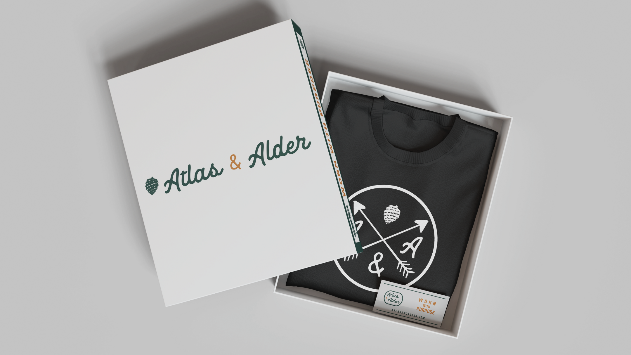
Hang tag and packaging

Creative Direction
“The Rugged Refined”
Our target persona is the man equally at home in the wild or at a whiskey bar. He’s discerning, adventurous, and intentional. His wardrobe reflects both his journey and his values. Think boots on the trail, blazer at dinner.
Outcome & Impact
The final brand identity positions Atlas & Alder as a heritage-forward menswear label with modern appeal. From logo to photography, every element reinforces a cohesive narrative of craftsmanship, masculine elegance, and purposeful living.
This design system offers flexibility across product lines, seasonal campaigns, and lifestyle storytelling—ensuring long-term visual consistency and emotional resonance with the ideal customer.
-
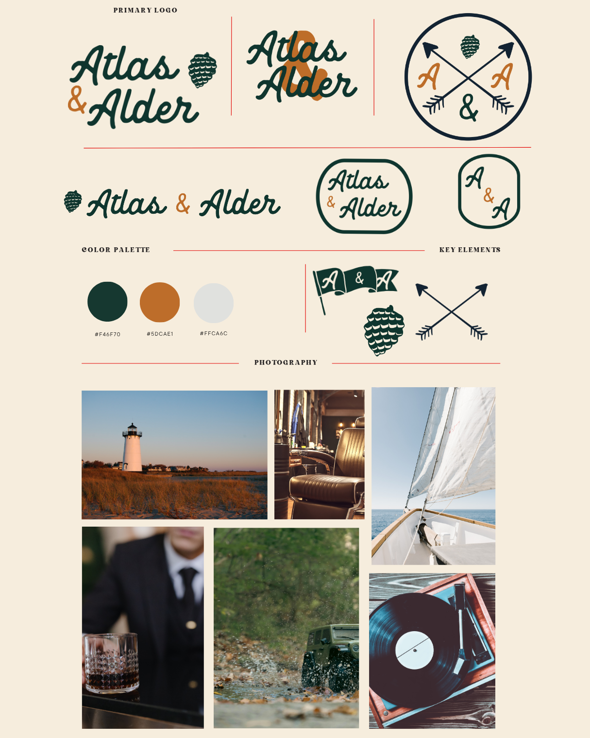
Custom script typography was chosen to reflect craftsmanship and authenticity. The organic curves of the hand-lettered “Atlas & Alder” suggest a human touch—each piece of clothing designed with care.
-
Deep Forest Green (#1F463D): Stability, nature, and durability
Earthy Orange (#5D6AE1): Warmth, heritage, and seasonal relevance
Pale Gray (#FFCAC6): Neutrality and modern refinement
These colors suggest timeless quality, while appealing directly to a masculine and style-conscious audience.
-
Subtle yet meaningful, the alder tree catkin nods to nature, masculinity, and tradition. It’s a timeless emblem of strength and quiet resilience—qualities embodied in both the clothes and the man who wears them.
Crossed arrows, waving flags, and the ampersand reinforce a sense of brotherhood, purpose, and direction. This is more than fashion—it’s a symbol of shared values and intentional living.
-
“Clean Ingredients for Every Body”
This inclusive, affirming tagline reinforces Sage’s commitment to purity, accessibility, and unisex appeal. It also anchors the brand’s broader mission: skincare made for everyone.
-
A curated photo style was developed to reflect the aspirational, rugged lifestyle of the Atlas & Alder man:
Lifestyle Moments: A glass of whiskey, a tailored suit, a sailboat at sea
Outdoor & Heritage: Lighthouse landscapes, forest trails, vintage interiors
Textural Depth: Rich lighting, warm tones, and natural materials
This moodboard doesn’t just showcase the clothing—it tells the story of a man who lives with purpose.