

CRUMB is more than a cookie — it’s a culture. This bold brand was developed as a punchy, irreverent response to cookie traditionalism. Designed for a new wave of snackers who want indulgence with edge, CRUMB leans into maximalism, nostalgia, and street-style attitude. From the saturated palette to the graffiti-adjacent flair, this brand is made to scroll-stop — and stick.
Case Study: Crumb Cookies
Branding & Packaging
Scope of Work
We were tasked with developing a complete visual identity and packaging system for Sage, including:
Brand Identity Design
Product Names
Logo Suite & Submarks
Custom Typography System
Color Palette
Mascot Design
Packaging Design
Moodboard & Brand Imagery
Brand Messaging / Tagline
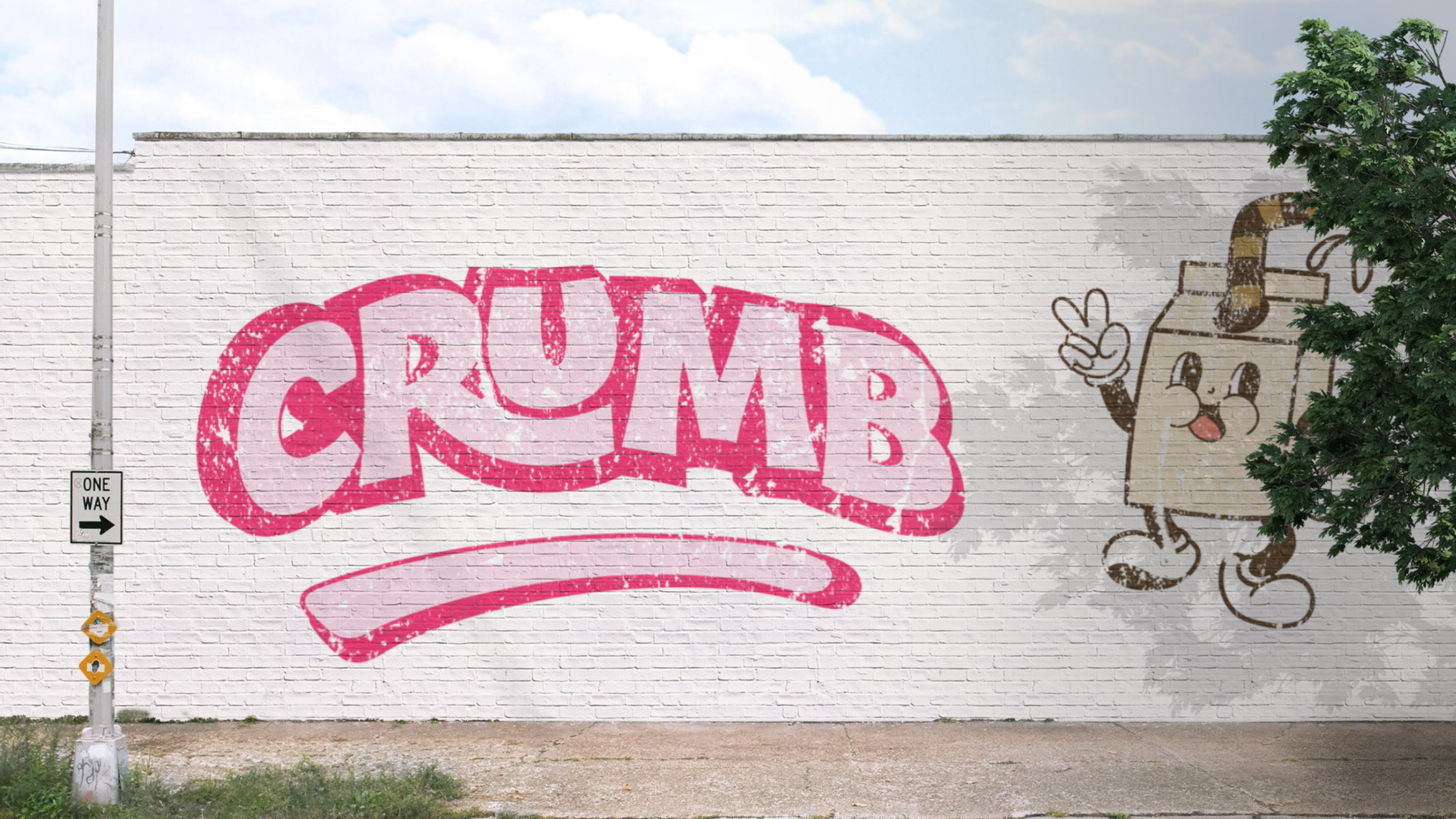
Mural Design
Brand Photography

Creative Direction
CRUMB reimagines cookies as statement snacks. The identity is scroll-stopping, indulgent, and deliberately extra — a perfect match for a brand that wants to stand out on-shelf, on-feed, and in-hand.
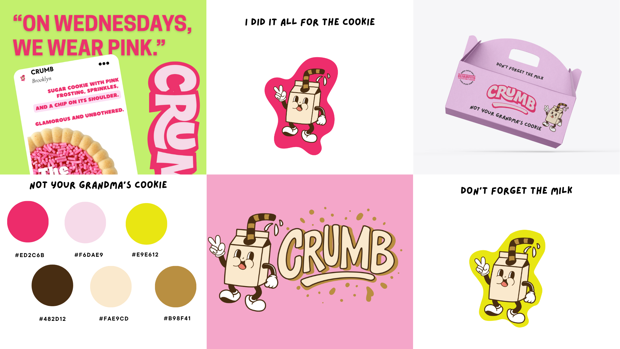
The visual identity for CRUMB Cookies is bold, playful, and unapologetically modern, pairing bright, candy-inspired colors with chunky, retro-style typography that pops against mouthwatering photography. Each cookie flavor gets its own personality through witty, cheeky copy and vibrant color blocking, while the recurring milk-carton mascot adds a charming, nostalgic touch. The overall look blends a sense of fun with a confident, slightly irreverent brand voice—making CRUMB instantly recognizable and irresistibly scroll-stopping.
-
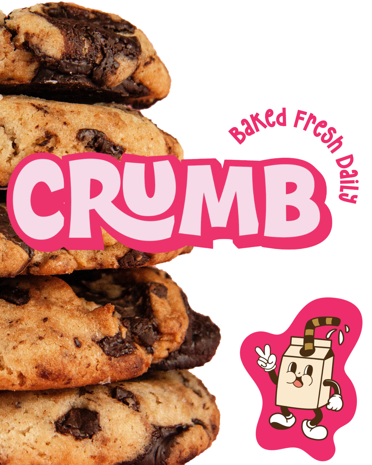
Primary Logo
The logotype is chunky, loud, and built to live big on packaging, merch, and social. The exaggerated curve beneath echoes frosting drips or a cookie bite, giving the brand motion and flavor.
Alternate Logos
Playful variants add versatility: a retro brown-on-tan treatment gives old-school diner energy, while the graphic mascot version ties into sticker culture, collectibles, and streetwear branding.
-
The colors are unapologetic and high-contrast:
ED2C6B — Loud pink for attention-grabbing impact
FAE9CD — Soft vanilla beige for balance
4B2D12 — Deep chocolate for warmth and richness
E9E612 — Neon yellow for flavor-forward flair
Golden crumb tones used as texture elements
-
Mascot Design
A walking milk carton (with a striped straw) introduces a nostalgic-but-modern character designed for Instagram Reels, packaging inserts, or animated content. It adds personality and ownability.
-
“Clean Ingredients for Every Body”
This inclusive, affirming tagline reinforces Sage’s commitment to purity, accessibility, and unisex appeal. It also anchors the brand’s broader mission: skincare made for everyone.
-
People who buy treats because of the vibe as much as the flavor
Social-first customers who value personality, design, and humor
Not Your Grandma's Cookie
*
Don't Forget the Milk
*
I Did It All for the Cookie
*
Crumb As You Are
*
Not Your Grandma's Cookie * Don't Forget the Milk * I Did It All for the Cookie * Crumb As You Are *
-
![]()
Baked Fresh Daily
-
![]()
Don't Forget the Milk
-
![]()
Reverse Cowgirl
-
![]()
The Regina George
-
![]()
Sugar Daddy
-
![]()
Oreo Speedwagon
-
![]()
Disco Dirt
-
![]()
Party In Ya Mouth
-
![]()
CRUMB

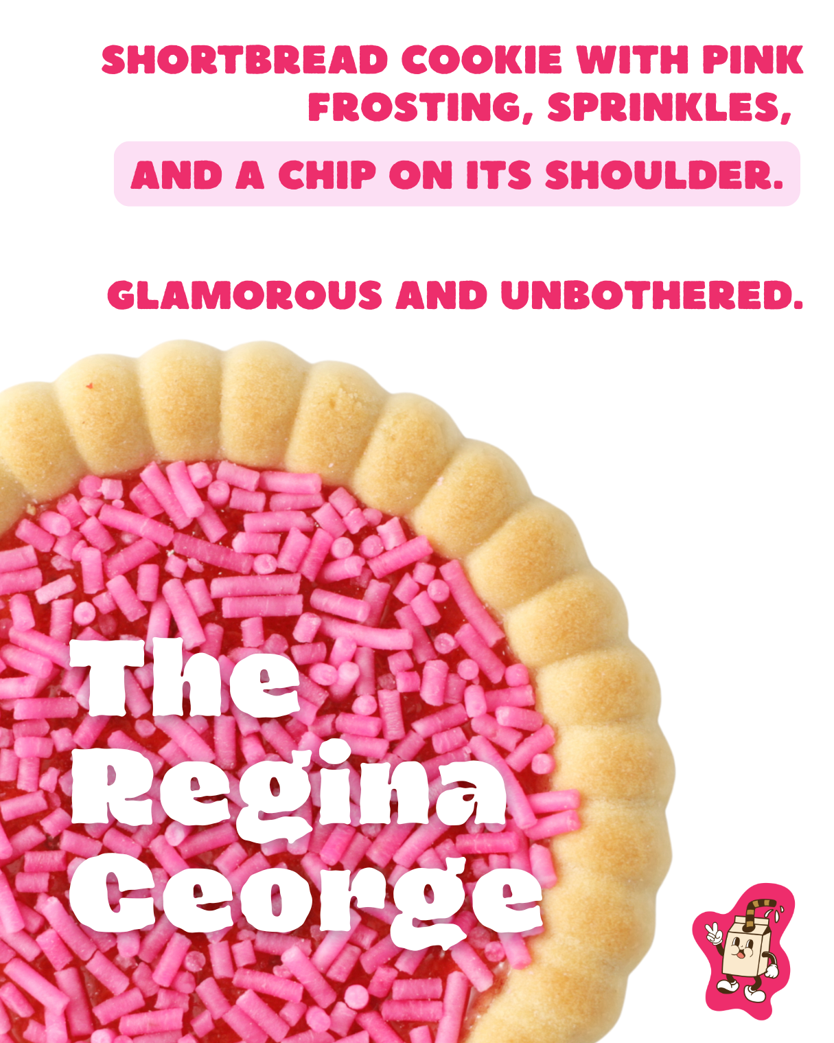
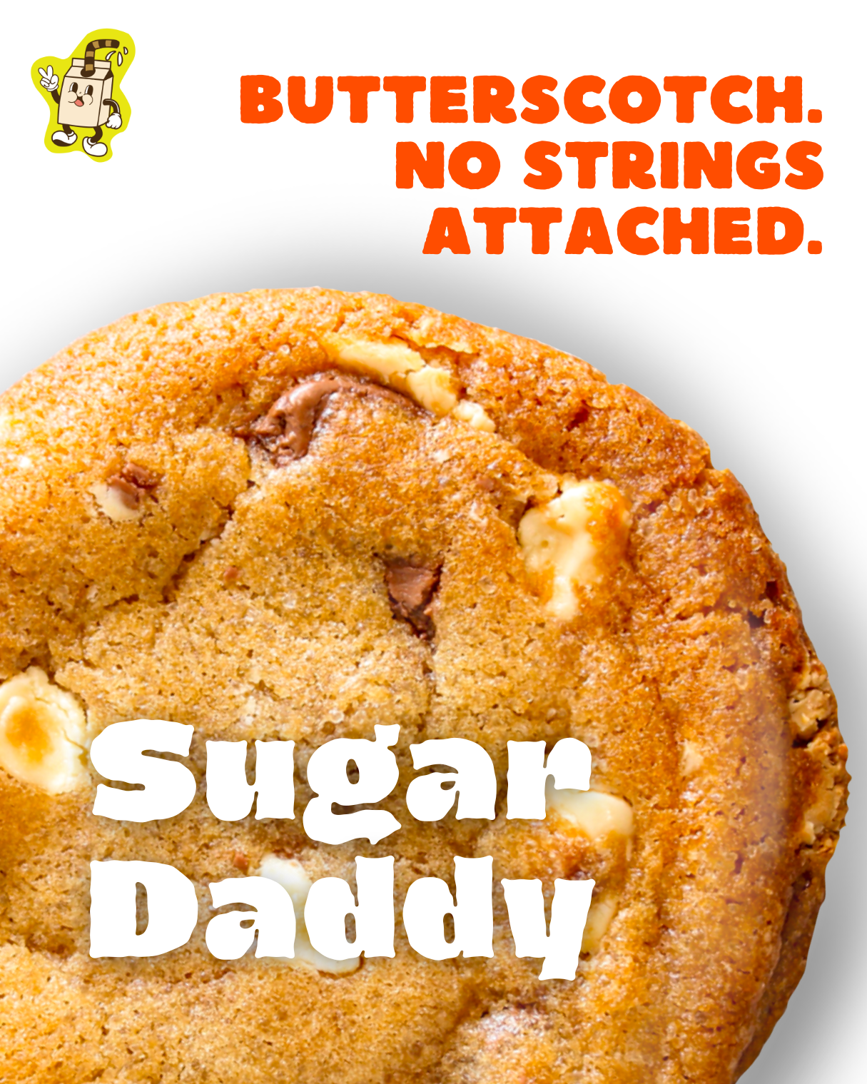
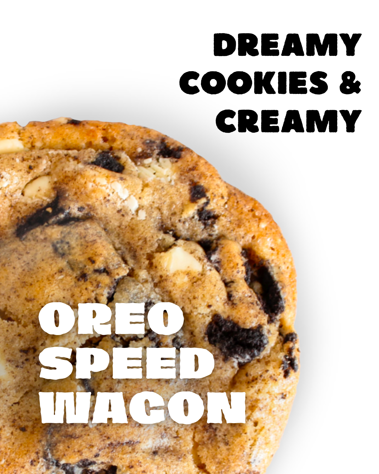
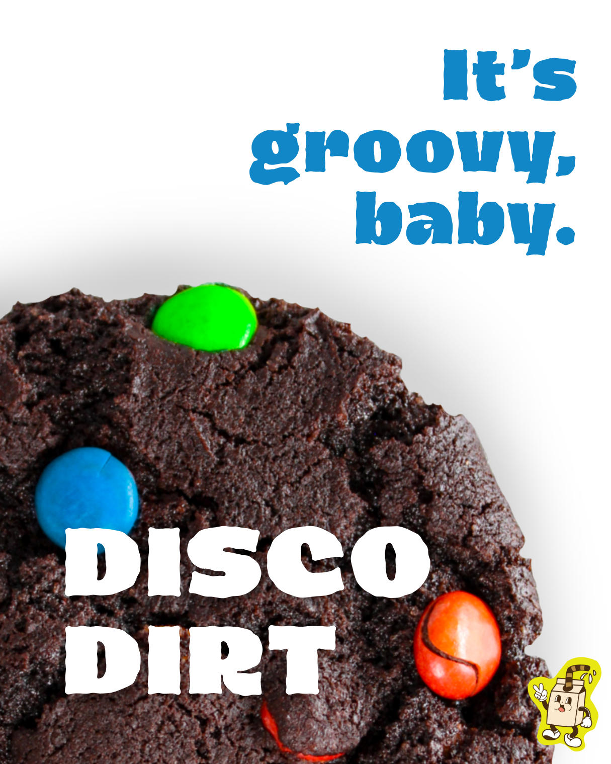
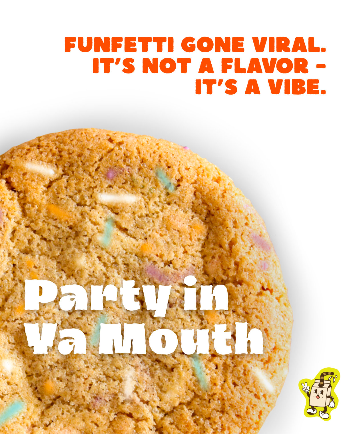

Each CRUMB cookie is more than just a flavor—it’s a character with its own name and personality, turning every bite into part of the brand’s playful story. From nostalgic nods to cheeky, modern puns, the names spark curiosity and make the cookies feel collectible, not just consumable. This approach invites customers to connect with the brand on an emotional level, remember their favorites by name, and share them with friends as if introducing a cast of delicious, quirky characters.