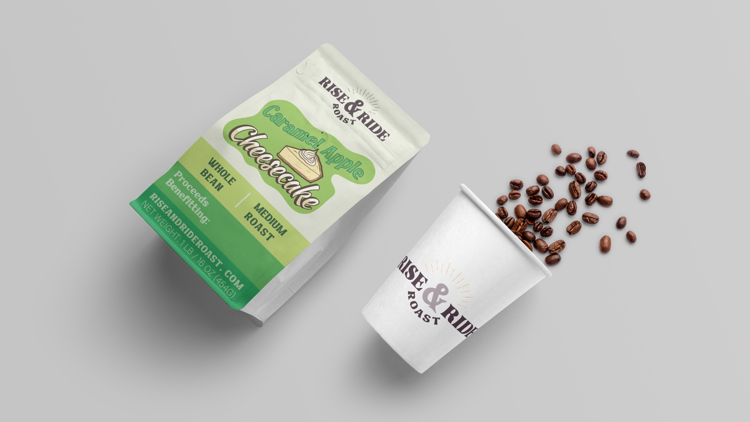
Case Study: Rise & Ride Roast
Branding + Tagline, Web Design, Packaging
We had the pleasure of building the visual identity for Rise & Ride Roast—a coffee brand created by and for equestrians.
As with any creative journey, we explored multiple directions—from Western-inspired character illustrations to the original tagline: “Put some giddy up in your cup.”
While that didn’t make the final cut, it helped shape the voice of the brand—along with another line we developed for the site: “Giddyup and Give Back.”

Scope of Work
We were tasked with developing a complete visual identity and packaging system for Sage, including:
Brand Identity Design
Logo Suite & Submarks
Custom Typography System
Color Palette
Key Brand Illustrations & Iconography
Packaging Design
Brand Messaging / Tagline
With a clear identity, versatile logo, and a visual system built for growth, Rise & Ride Roast is saddled up and ready to scale. Their mission-forward story—blending caffeine, care, and community—has already found traction among equestrian enthusiasts nationwide.
CREATIVE DIRECTION
-
The logomark fuses two essential elements: the warmth of coffee and the grace of horses. Clean, balanced, and flexible, it works across packaging, apparel, signage, and digital.
Typograpy
We paired a strong, no-nonsense serif for headers with a clean sans-serif for body copy—giving the brand a balance of refinement and approachability.
Headline: Transitional Serif – Stable, classic, elegant
Body: Geometric Sans – Clean, legible, modern
-
At the heart of the palette:
Deep Purple – A personal favorite of the founder and the anchor color for the brand and its sister company, Bedding Blocker®.
To add dimension and freshness, we introduced strategic accent colors:
Vibrant Green – for growth and energy
Sunny Orange – for optimism and warmth
Bright Aqua – for freshness and clarity
These pops of color inject life into the digital experience and product storytelling without diluting the brand’s core identity.
-
Rise & Ride’s voice is confident, warm, and equestrian-savvy. It speaks to riders without pandering—blending insider language with universal values like energy, care, and purpose.
We developed two key lines to support brand messaging and campaigns:
“Put Giddy Up In Your Cup” – an early concept that helped shape the brand’s playful, spirited tone.
“Giddyup and Give Back” – now used across digital promotions to highlight the brand’s mission of supporting horse rescues.
The final tagline, “Start Your Day in Stride,” was created by founder April, and now serves as the brand’s headline across the website and marketing materials.
Giddy-Up & Give Back
*
Start Your Day in Stride
*
Put Giddy Up In Your Cup
*
Giddy-Up & Give Back * Start Your Day in Stride * Put Giddy Up In Your Cup *


